Friday, 27 April 2012

Storyboard Analysis
Before we started the production of our trailer was to create a storyboard to use as a guideline so that we could build from something and generate better ideas whilst going along. This really helped because we had a basis to go with and then we just had to either improve the ideas or change them.
.bmp)
.bmp)
.bmp)

Friday, 16 March 2012
Friday, 3 February 2012
AUDIENCE FEEDBACK QUESTIONNAIRE RESULTS
 From these results I can gather that we have achieved what we wanted the audience to feel from the orchestral music which was non-diegetic sound which evidently caused the majority of the audience to feel tense and scared which conveys that they recognised it was the horror genre.
This graph illustrates that the setting we used we perfect for the horror genre as it followed typical codes and conventions of real life horror trailers for example; violent attacks on the main protagonists, low key lighting and it created a spooky isolated atmosphere.

 The statistical data illustrates that the preponderance of people felt that the plot was revealed enough this was challenging because we had to follow Todorov's theory which is the idea of a linear narrative which consisted of beginning with an equilibrium then the disturbance of the equilibrium finishing with a cliff-hanger, leaving the audience wanting to know what happens next usually using an enigma code which supports Roland Barthes' theory of semiotics, in our trailer that was our main protagonist struggling to get into the car and the camera getting closer to his face which leaves the audience wondering what is going to happen to him.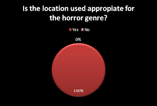
Friday, 16 December 2011
Reflection on the Filming
How did you work together as a group?
As a group we started by assigning roles to each other so we covered every aspect as we went and that we didn’t forget anything, initially I was allocated to be in charge of directing and editing, Robert was in charge of mise en scene and designing the poster and magazine and Muaadh was in charge of the sound, dialogue and getting people to be in trailer this was because we each excelled in those areas however we assisted each other. We worked well as a group as Muaadh got people to be involved in the trailer and they thoroughly enjoyed being the video which made it easier to film. Allocating specific roles to each of us made the quality of our work be more suffient and more accurate to what we wanted, as it was more organised. We all had specific roles so for example: I was in charge of directed and editing so therefore I had an image in my head that I could do an match eyeline frame shot but I also knew that when editing I can zoom into my character which made the match eyeline frame more authentic as I had to distinguish where to position my friend holding the camera and where I should be in the shot.
What were you responsible for doing?
I was responsible for directing what shots should be used and what angles to approach them I was mainly responsible for this because I direct and edit music videos in my spare time in addition I was responsible for the editing because I have a background experience in editing which was an advantage to our group also I have a program at home to edit which made it easier to find time to edit it as that is the longest part of the production. Also I carried out ongoing editing so if I thought that we needed more shots it was my role to gather the group together and get those shots that I needed. As I had background experience of editing videos I used a program which I use at home called Sony Vegas Pro 10.0. As we were producing a horror movie trailer I knew that close ups were important to show how scared they were or if they were struggling to illustrate this was a horror movie so the audience recognize the genre immediately.
When I was directing I may have been a little strict or short tempered but this was to ensure that everyone followed instructions however I was easy to negotiate with because I know I'm not a professional video director so I listened to others ideas and for example when deciding what shot was needed for the end when I was trying to get into the car I suggested the last shot to be an extreme close up of the keys dropping on the floor whereas, Muaadh suggested switching scenes from a Point of view shot from the killers view and an extreme close up of my character struggling to get into the car because this will build up the suspense more and with the epic fast paced music in the background which Muaadh was responsible for it suited well and it worked.
What locations did you choose and why?
We chose the majority of the trailer to be in the woods this was decided as a result from distributing questionnaires and some people suggested they would want to see a horror movie in a woods also through research we was using ‘The Hills have Eyes’, ‘Wilderness’ and ‘Wrong Turn’ as a guide and they were successful horror films which were set in the woods. Additionally we chose the woods because it was feasible to get there as it was not too far from our school which was why we didn’t use a haunted house which our questionnaire results gave us because it would be very time consuming. We also used our teacher's office for the opening shots where we receive the camping assignment for our boss to allow the audience to understand the plot of this film. I used my bedroom to stick up a few photos of all of us at parties and having a good time with friends to imply innocence for the characters for the shot where the killer has circled who he has targetted because my bedroom had a plain white wall for me to do that additionally I used my garden at night for the close up of the killer holding the knife with blood because I also had a garden light to help me.
What props did you use in your trailer?
We used a large knife as the killer’s weapon because it is a very typical murder weapon's also it is very phallic. We used fake blood to create a more authentic look to the killer and victims linking to this we used gloves for the killer at times to hide his identity in the trailer because we did not give away his identity for the whole trailer but in the film you would find out who the killer was. We used photos of us for the trailer to illustrate we were the killers targets hence our slogan ‘Unfinished Business….’ because the killer wants to seek revenge. We attempted to create a fire in the woods to give authenticity that we were at camp, this was difficult as we had to use paper because the wood was wet but we managed to create a little fire. We used a car to make it look more like we were older men from work given this assignment.
How did you create a realistic atmosphere?
The realistic atmosphere was created by the location as it was very isolated and could see the roads also specifically in scenes were Robert gets snatched Muaadh and my pal Imran shook the bushes to make it seem like there was a movement so Robert becomes agitated and frightened. Furthermore to create the correct atmosphere facial expressions were very important to look afraid and unaccompanied. The camera angles used were important to create the realistic atmosphere therefore close ups such as, as soon as Robert hears the bushes moving you see his facial expression to illustrate he is terrified and this caused the audience to believe that if the character is scared then they may be scared and recognize it is a horror movie.
Were there any difficulties you faced whilst filming? (People walking into your shots?) How did you resolve this issue?
People walked into our shots at the end as it was just outside the woods where the car was parked and it made it difficult to shoot so we had to wait till they left, this meant that we knew we had to shoot quickly before any more people pass through this wasn’t much of a problem because we followed our storyboard so we knew what we had to do exactly with facial expressions, sounds and what the shot entailed.
As a group we started by assigning roles to each other so we covered every aspect as we went and that we didn’t forget anything, initially I was allocated to be in charge of directing and editing, Robert was in charge of mise en scene and designing the poster and magazine and Muaadh was in charge of the sound, dialogue and getting people to be in trailer this was because we each excelled in those areas however we assisted each other. We worked well as a group as Muaadh got people to be involved in the trailer and they thoroughly enjoyed being the video which made it easier to film. Allocating specific roles to each of us made the quality of our work be more suffient and more accurate to what we wanted, as it was more organised. We all had specific roles so for example: I was in charge of directed and editing so therefore I had an image in my head that I could do an match eyeline frame shot but I also knew that when editing I can zoom into my character which made the match eyeline frame more authentic as I had to distinguish where to position my friend holding the camera and where I should be in the shot.
What were you responsible for doing?
I was responsible for directing what shots should be used and what angles to approach them I was mainly responsible for this because I direct and edit music videos in my spare time in addition I was responsible for the editing because I have a background experience in editing which was an advantage to our group also I have a program at home to edit which made it easier to find time to edit it as that is the longest part of the production. Also I carried out ongoing editing so if I thought that we needed more shots it was my role to gather the group together and get those shots that I needed. As I had background experience of editing videos I used a program which I use at home called Sony Vegas Pro 10.0. As we were producing a horror movie trailer I knew that close ups were important to show how scared they were or if they were struggling to illustrate this was a horror movie so the audience recognize the genre immediately.
When I was directing I may have been a little strict or short tempered but this was to ensure that everyone followed instructions however I was easy to negotiate with because I know I'm not a professional video director so I listened to others ideas and for example when deciding what shot was needed for the end when I was trying to get into the car I suggested the last shot to be an extreme close up of the keys dropping on the floor whereas, Muaadh suggested switching scenes from a Point of view shot from the killers view and an extreme close up of my character struggling to get into the car because this will build up the suspense more and with the epic fast paced music in the background which Muaadh was responsible for it suited well and it worked.
What locations did you choose and why?
We chose the majority of the trailer to be in the woods this was decided as a result from distributing questionnaires and some people suggested they would want to see a horror movie in a woods also through research we was using ‘The Hills have Eyes’, ‘Wilderness’ and ‘Wrong Turn’ as a guide and they were successful horror films which were set in the woods. Additionally we chose the woods because it was feasible to get there as it was not too far from our school which was why we didn’t use a haunted house which our questionnaire results gave us because it would be very time consuming. We also used our teacher's office for the opening shots where we receive the camping assignment for our boss to allow the audience to understand the plot of this film. I used my bedroom to stick up a few photos of all of us at parties and having a good time with friends to imply innocence for the characters for the shot where the killer has circled who he has targetted because my bedroom had a plain white wall for me to do that additionally I used my garden at night for the close up of the killer holding the knife with blood because I also had a garden light to help me.
What props did you use in your trailer?
We used a large knife as the killer’s weapon because it is a very typical murder weapon's also it is very phallic. We used fake blood to create a more authentic look to the killer and victims linking to this we used gloves for the killer at times to hide his identity in the trailer because we did not give away his identity for the whole trailer but in the film you would find out who the killer was. We used photos of us for the trailer to illustrate we were the killers targets hence our slogan ‘Unfinished Business….’ because the killer wants to seek revenge. We attempted to create a fire in the woods to give authenticity that we were at camp, this was difficult as we had to use paper because the wood was wet but we managed to create a little fire. We used a car to make it look more like we were older men from work given this assignment.
How did you create a realistic atmosphere?
The realistic atmosphere was created by the location as it was very isolated and could see the roads also specifically in scenes were Robert gets snatched Muaadh and my pal Imran shook the bushes to make it seem like there was a movement so Robert becomes agitated and frightened. Furthermore to create the correct atmosphere facial expressions were very important to look afraid and unaccompanied. The camera angles used were important to create the realistic atmosphere therefore close ups such as, as soon as Robert hears the bushes moving you see his facial expression to illustrate he is terrified and this caused the audience to believe that if the character is scared then they may be scared and recognize it is a horror movie.
Were there any difficulties you faced whilst filming? (People walking into your shots?) How did you resolve this issue?
People walked into our shots at the end as it was just outside the woods where the car was parked and it made it difficult to shoot so we had to wait till they left, this meant that we knew we had to shoot quickly before any more people pass through this wasn’t much of a problem because we followed our storyboard so we knew what we had to do exactly with facial expressions, sounds and what the shot entailed.
Wednesday, 14 December 2011

Tuesday, 15 November 2011
Questionnaires

This illustrates that predominantly males were asked so could potentially give inaccurate results in future I would ask more females to give me a better idea of what people would want in a horror film trailer.

This graph suggests again potentially I should have asked more of a range of different ages because that would give me more of an accurate set of results. There was more 15 - 18 so this means we would not be as explicit because the age rating would be 15 so we will use blood but just not as much to be too violent.

The majority of participants said they would want to see a horror movie set in a city however we are going against this research because we did collect some results for it to be in the woods so it wouldnt be going fully against these results. The reason we have chose the woods is through research on other horror movies also because it links in well with our storyline.

Magazine Research
1. What is the title, price and frequency of the your magazine (weekly/monthly)
The title of our magazine is 'Memory' we chose this name because it connotes death in terms of remembering someone who has died so this would link to the horrror genre because from research I have noticed the title is usually related to death or in gore such as 'Gorezone', 'Virus', 'Horrorhound'. The price of our magazine would be targeted at over 15's so we would issue it for £1.50. The magazine would have to be a monthly issue as new films do not get released every day so there would not be alot to include in the magazine.
2. Where will your title be? (Font/position/size/name?)
I have noticed from research that the font of the title is usually in either a gothic style or gorry style and because we are calling the magazine 'Memory' I think it would suit to be in a gothic font, additionally all magazines I have researched in the horror genre use the colour black red and white, the red is a semiotic to illustrate blood, we may use a red text against a dark background however that may not make the title stand out.
3. What the pictures will you use? What will they suggest?
The main photo will either be a mid shot or long shot of the 3 main protaganists with the red eyes of the monster in our film behind us and with our facial expressions being afraid and shocked this will suggest the monster is after us. I also think it is important that we include a photo of a celebrity from another upcoming film that will be using the two-step flow theory of getting people attracted to the magazine. The magazine below shows a photo of Natasha Lyonne so fans of her would be instantly attracted to the magazine.
4. What information will you give about the magazine’s contents?
- How will this information be given? (gimmicks, quotes)
I would include a cliffhanger on the front cover of our film with a little caption saying something along the lines of 'Will they all survive?' this will engage readers to want to see inside but also to do that use the celebrity endorsement and write a caption saying 'find out what their favourite film is and their DIRTIEST SECRET' this will instantly engage the readers. Finally along the sides of the magazine I may include gimmicks and other films that are coming out.
6. How will you appeal to your target audience? (Gender, age, type of person)
The targetted audience for our magazine will be over 15's predominantly males but anyone who is interested in horror films this could be focused on gothic people, grungers, people who have a rock background so to target them I may write a gimmick at the top saying 'win free tickets to see slipknot live!', but it could also be targeted at couples because couples like to watch horror films together.
The title of our magazine is 'Memory' we chose this name because it connotes death in terms of remembering someone who has died so this would link to the horrror genre because from research I have noticed the title is usually related to death or in gore such as 'Gorezone', 'Virus', 'Horrorhound'. The price of our magazine would be targeted at over 15's so we would issue it for £1.50. The magazine would have to be a monthly issue as new films do not get released every day so there would not be alot to include in the magazine.
2. Where will your title be? (Font/position/size/name?)
I have noticed from research that the font of the title is usually in either a gothic style or gorry style and because we are calling the magazine 'Memory' I think it would suit to be in a gothic font, additionally all magazines I have researched in the horror genre use the colour black red and white, the red is a semiotic to illustrate blood, we may use a red text against a dark background however that may not make the title stand out.
3. What the pictures will you use? What will they suggest?
The main photo will either be a mid shot or long shot of the 3 main protaganists with the red eyes of the monster in our film behind us and with our facial expressions being afraid and shocked this will suggest the monster is after us. I also think it is important that we include a photo of a celebrity from another upcoming film that will be using the two-step flow theory of getting people attracted to the magazine. The magazine below shows a photo of Natasha Lyonne so fans of her would be instantly attracted to the magazine.
4. What information will you give about the magazine’s contents?
- How will this information be given? (gimmicks, quotes)
I would include a cliffhanger on the front cover of our film with a little caption saying something along the lines of 'Will they all survive?' this will engage readers to want to see inside but also to do that use the celebrity endorsement and write a caption saying 'find out what their favourite film is and their DIRTIEST SECRET' this will instantly engage the readers. Finally along the sides of the magazine I may include gimmicks and other films that are coming out.
6. How will you appeal to your target audience? (Gender, age, type of person)
The targetted audience for our magazine will be over 15's predominantly males but anyone who is interested in horror films this could be focused on gothic people, grungers, people who have a rock background so to target them I may write a gimmick at the top saying 'win free tickets to see slipknot live!', but it could also be targeted at couples because couples like to watch horror films together.
Wednesday, 9 November 2011
Key elements needed for our group film poster

Betrayed is a horror movie that includes many of the main conventions to identify it is a horror movie. Firstly the lowkey lighting indicates it will be a gloomy film and danger as the photos are in the shadows. To authenticate it is in the horror genre the faceial expression of the young innocent woman is scared and shocked, this is illustrated with her eyes widened and looking towards the othger photo of the close up of an older man but the opacity of his photo is reduced giving a view as if he isnt really there. This photo links to Claude Levi-Strauss theory of the idea of good vs evil where we see the potential villain in the film next to the protaganist this gives the audience an idea of what the film entails. In our film we have a villain as a monster so we could use this as an idea because the group of us are the innocent protagnists but there is a monster in the woods with us so for out poster we could potentially have the eyes of the monster next to us looking all scared with frightened faces.
Tuesday, 8 November 2011
A2 MEDIA - HORROR GENRE CONVENTIONS
How did analysing the film trailer to Omen 2006 help you to think about the conventions of the horror genre?
The Omen is a classic horror movie and as it is an old movie the poster follows the conventions of a typical horror movie with different aspects of it. I believe it fits into the horror genre by primarily the semiotics used, the colour of black and red which could connote blood and evil which authenticates it is in the horror genre. Additionally the grave yard of crosses illustrates death and the lighting is red with a little pale faced boy standing which a straight face showing no emotion which makes the audience question what is he up to and what is so significant about him so they would want to watch the film in connection with that there is a slogan ‘Hes the beginning of the end’ which is an oxymoron to confuse the audience and engage them to want to see the movie. The title is in a gothic type of writing which makes it more daunting and it stands out contrasting with the red background.
Todorovs theory applies to the trailer to a certain extent as it begins with the equilibrium with a birthday party in a sunny town of a small innocent boy where everyone is happy but very soon after a woman jumps off a building resulting into hanging herself which begins to show the disequilibrium quickly and this would be to enforce it is quite scary and violent straight away to the audience and the bloodcurdling music matches the mood as the plot begins to get revealed even more if Todorovs theory fully applied to the trailer then it would typically finish on an equilibrium but this is challenged because it is left on a cliffhanger of a lady saying ‘please don’t let him kill me’ and then a very frightening scream which makes the audience wonder what has happened to her and if she is alright so this would not follow Todorovs theory completely.
How does this
fit into the horror genre?
What are the
typical conventions?
How does this attract the targeted audience?
http://www.youtube.com/watch?v=iuU7WpoPE3Y (Trailer 1)
http://www.youtube.com/watch?v=bqworUizlLk&feature=related (Trailer 2)
EXT: How does this conform to Tdorov's theory?
The Omen is a classic horror movie and as it is an old movie the poster follows the conventions of a typical horror movie with different aspects of it. I believe it fits into the horror genre by primarily the semiotics used, the colour of black and red which could connote blood and evil which authenticates it is in the horror genre. Additionally the grave yard of crosses illustrates death and the lighting is red with a little pale faced boy standing which a straight face showing no emotion which makes the audience question what is he up to and what is so significant about him so they would want to watch the film in connection with that there is a slogan ‘Hes the beginning of the end’ which is an oxymoron to confuse the audience and engage them to want to see the movie. The title is in a gothic type of writing which makes it more daunting and it stands out contrasting with the red background.
Todorovs theory applies to the trailer to a certain extent as it begins with the equilibrium with a birthday party in a sunny town of a small innocent boy where everyone is happy but very soon after a woman jumps off a building resulting into hanging herself which begins to show the disequilibrium quickly and this would be to enforce it is quite scary and violent straight away to the audience and the bloodcurdling music matches the mood as the plot begins to get revealed even more if Todorovs theory fully applied to the trailer then it would typically finish on an equilibrium but this is challenged because it is left on a cliffhanger of a lady saying ‘please don’t let him kill me’ and then a very frightening scream which makes the audience wonder what has happened to her and if she is alright so this would not follow Todorovs theory completely.
How does this
fit into the horror genre?
What are the
typical conventions?
How does this attract the targeted audience?
http://www.youtube.com/watch?v=iuU7WpoPE3Y (Trailer 1)
http://www.youtube.com/watch?v=bqworUizlLk&feature=related (Trailer 2)
EXT: How does this conform to Tdorov's theory?
Thursday, 24 March 2011


Presentation Feedback
Last week I did my presentation and went well (I will be uploading it to my blog soon) The main problem i had is that i did not include 4 photos and on the syllabus it says you need 4 pictures whereas I only had 3. From this feedback I have now imported two screenshots from Melodi's video and put it into the interview to make it look more interesting and relate to what he is saying. I recieved alot of positive feedback on the fact i specified my target audience.
Wednesday, 9 March 2011
How does my music magazine represent particular social groups ?
My magazine represents grime being a genre which is not as appreciated as other genres so therefore it represents young males (my targeted audience) as being young and different developing a new style of music also this represents Melodi of being fit and young by his baseball jacket being worn also his posture shows alot of confidence and strength.
Monday, 7 March 2011
Looking back at my preliminary task, what do I feel I have learnt in the progression from it to the full product?
I believe I have improved so much since my preliminary task due to my improved understanding of InDesign therefore I have learnt a lot of the specifics in using the program. I have also learnt more about the codes and conventions and how essential they are, due to learning more of the denotations of some of the codes and conventions for music magazines. I have improved thanks to the feedback from miss norville but also from my class mates and Jamie who helped me with specific problems with the program such as cropping and sorting out the layers and many more different minor problems that I come across. From my preliminary task I have learnt I need to stick to certain colors and fonts instead of mixing them up.
What have I learnt about technologies from the process of constructing this product?
From my magazine I have learnt how to use InDesign much better than when I made my school magazine, I used photoshop only to crop pictures but everything else in InDesign. In my front cover I was able to change colors of the text to make certain parts stand out I also learnt how to rotate text at angles. In my contents I put pictures behind the text which was something I didnt know how to do but learnt due to the help of Jamie. Finally in my double page spread I learnt how to bend the text around the image in order to make it more interesting and different than some double page spreads in music magazines, therefore I challenged the codes and conventions.
I approached InDesign not knowing where to start but I learnt from my school magazine what I should do first, so first I did the background with a gradient which set the mood then I did the title which reflected the background after that I got the mid shot photo of Melodi so then I could see exactly how much space I have to fill in with anything I want, which helped me construct my time well. Overally I think I have improved tremendously since my school magazine because of my use with InDesign.
I approached InDesign not knowing where to start but I learnt from my school magazine what I should do first, so first I did the background with a gradient which set the mood then I did the title which reflected the background after that I got the mid shot photo of Melodi so then I could see exactly how much space I have to fill in with anything I want, which helped me construct my time well. Overally I think I have improved tremendously since my school magazine because of my use with InDesign.
How did I attract my audience?
In order to attract my audience I began by attracting grime fans by using the colours from http://www.grimedaily.com/ because this is the main source to grime music also i used a similar logo as the title as Grime Daily because this would catch grime fans eyes. I used Melodi as my main photo because he is an upcoming artist who is heading in the right direction so for young people who have a dream they can look up to Melodi in a way to show that anyone can do what they put there heart to. Wretch 32 is one of the best grime artists in the UK with a huge fan base so I included his latest single in my magazine because it is a succesful grime song in the charts which doesnt happen often so putting that there attracts people who are interested in that song. Additionally I attracted Melodi's fans by putting his latest mixtape on the front and made the the name 'Minor To A Major Vol. 1' in white to make it stand out, Melodi's fans will see this and will want to hear it.
Who is the targeted audience?
The audience of my magazine is generally 12 – 20 year olds who are interested in grime music but it can narrow down to teenagers who are interested to enter the grime scene because I included a interview with ‘Melodi’ and that shows his journey which can be inspiring. It is not targetted at any specific gender however mostly males are interested in grime. Also I included a rhetorical question including 'Lady Gaga' who is a worldwide artist so therefore her fans would be interested in the magazine, which also applies to the other grime artists i included along the side. Also rap music as a whole has mainly attracted black people but over the years white people are interested in the music so it is not targeted at any specific race.
.
What kind of media institution might distribute my media product and why?
A low budget brand new media institituion may be interested in distributing my magazine because there are no grime magazines out at the moment and that may be because Grime as a genre have not evolved enough and there needs to be more fans in general for Grime. So therefore this brand new media institution will be more able to take risks and distribute my magazine. Also a media institution which focuses on younger people would distribute my magazine because the majority of grime fans are teenagers and also the magazine is inspiring as it would appeal to young people who have a dream.
Subscribe to:
Posts (Atom)